


BUENA PARK
I GREW FROM THE LAND
Brianna Ibarra
Idea: “I Grew from the land” represents my connection to my roots and identity. It reflects how I am shaped by where I come from, the culture I carry inside me, and the difficulty of feeling separated from those roots while still growing from them.
Materials: Acrylics, cardboard, markers, watercolor, fabrics, threads, bottle caps, crayons, and Prismacolor.
Process: I experimented with mixed media, using fabric, cardboard, thread and paint. The central image was created on paper, then reinforced with cardboard. I explored new materials through layering and collage to build texture and meaning.
BLIND-SIGHT
Amelia Camareno
Idea: With the constant belief that our choices are always right, it can cause damage to our health. You might find yourself attracting unwanted & harmful attention or habits. Like those ants creeping toward the unhealthy, moldy tomatoes.
Materials: Lace/Cardboard/Prismacolor pencils/White Gel pen/Acrylic Marker
Process: After illustrating with color pencils, I flattened the piece to black paper. The added lace & cardboard for texture while also incorporating complementary colors for a pop. In this piece I aimed to illustrate a variety of contrast in shape & color.
2026 2D & Graphic Design
DEATH TO THE PAST
Hannah Black
Idea: Why should we reflect and adapt to our experiences? Self observation, witness our change, death of old ways, necessary for a new version of self to grow. Painful process of shedding past self, flowers symbolize fertile ground for new growth, crow represents transition.
Materials: iPhone 16, Photoshop, iBis Paint
Process: Multiple layer photography exposures of self portrait in agony with symbolic props like flowers and taxidermy. Photoshop and iBis paint using overlays hue adjustments. Crow picking eyeball peeling back the new mystery, beneath is future growth.
TOUCHED BY FAITH
Mya Monroe
Idea: How can our faith help us thrive and become determined? As stated in Philippians 3:13-14 "straining toward what is ahead, I press on toward the goal." Pushing forward out of chaos to stay focused in challenging times, never giving in to negative thoughts.
Materials: Camera, Photoshop
Process: Illustrated sketches first to tell my story and impact the viewers. I collaged my self-portrait reaching out for Divinity. Struggles with tears that shaped my life. Collaged various symbolic images in different layers on Photoshop. Self-portrait reaching out to Divinity, puzzle pieces depicting chaos.
FULLERTON UNION
ENVY
Brigid Sapp
Idea: Growing up, I didn't have the vocabulary to explain why I felt disconnected from my own body, and from the people around me. Once I discovered I'm non-binary, my whole perspective changed.
Materials: Acrylic paint, Polaroid photos, glue, thread, pen/fine liners
Process: My idea was to personify the sin of envy into a character based on the phrase 'you'd kill for those features'. The character is a girl sewing on the face of another, trying to become beautiful; she hurt others for what she wants, but also herself.
ON TOP OF THE WORLD
Parker Linder
Idea: I wanted to create a compelling composition using my own original characters. I wanted to create a story about an unlikely friendship between a pirate and a prince, and thought a scene of them bonding would be fun to draw to develop their relationship.
Materials: IPad Pro, Procreate
Process: My first course of action was to create sketches of potential compositions once I had the idea. Once I found a composition I liked, I cleaned up the sketch and did the lineart. After lineart, I added colors, shading, and the background, and then I had the finished piece.
UNLIKE ME
Leila Montanez
Idea: I have a hard time explaining how I'm feeling, especially with negative emotions like anger. My overall idea was to explore the idea of what my emotions look like to me. I did this by playing with textures, shapes, color and value.
Materials: Acrylic paint, accent beaded embroidery
Process: I started with an initial sketch of a self portrait. On the canvas, I experimented with finger painting and different sized brush strokes. After finishing the painted part, I weave through the designated holes on the paper and add beads.
BEFORE THE WORLD SPEEDS UP
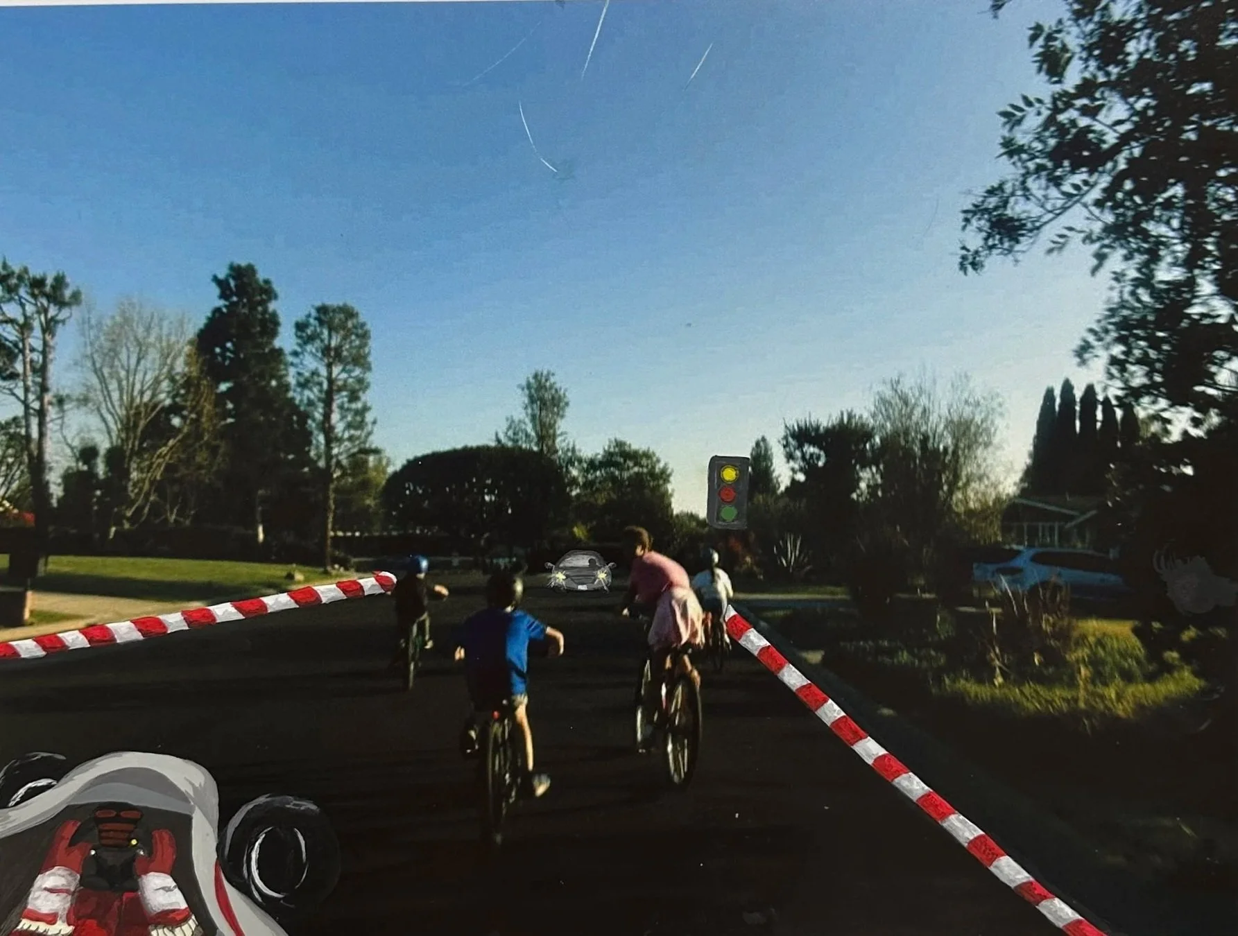
Mya Monroe
Idea: I wanted to show the contrast between a child’s free imaginative mind and the rigid and high-pressure mindset that occupies the adult mind. The kids joyfully ride bikes on a painted track while an oncoming car ahead evokes adult urgency and authority.
Materials: Acrylic paint and photo paper
Process: I planned the illustrations, then layered acrylic paint to build value and depth. I used multiple coats to strengthen contrast and separate the children’s imaginative world from the rigid responsibility that employs adults.
LA HABRA
DISTORTED
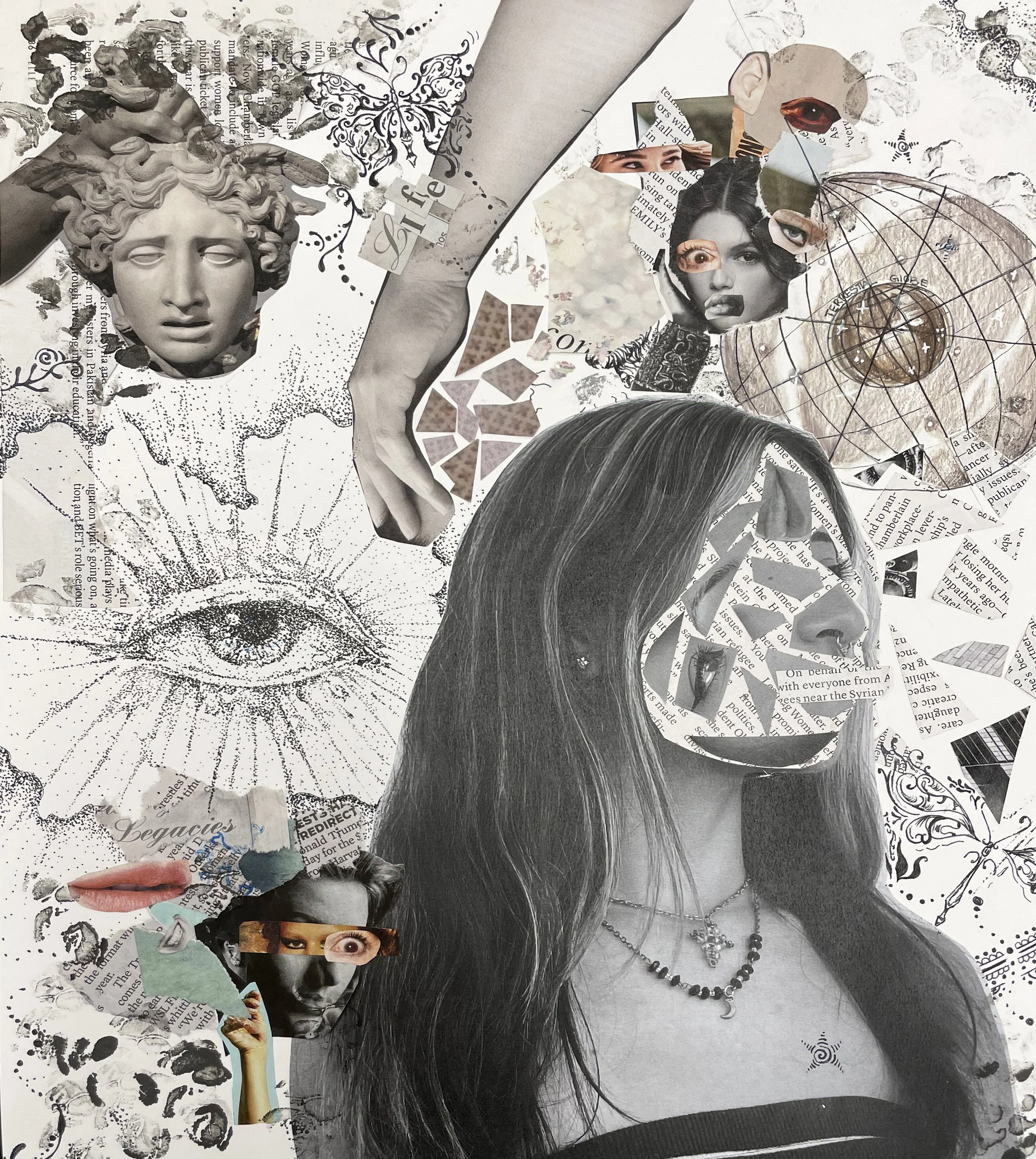
Kash Madrigal
Idea: My idea for this was to scatter pieces of face while keeping them in the frame of my head. I also wanted to distort other faces. The elements of book/newspaper are representing a scatter of thoughts and ideas.
Materials: Pen, ink, colored pencil, paper collage
Process: I had multiple pictures of me taken to practice with and then made some rough draft compositions. For the final piece, I planned out where I wanted each cut out, then added additional drawings in the negative spaces.
LA VISTA
CANELITO
Nathan Fuentes
Idea: Favorite Boxer
Materials: Word generator that turns words into art
Process: Having to research more about canelo
EYES ON YOU
Allison Miranda
Idea: To create a T-Shirt Design using my eyes.
Materials: My phone, Photoshop, Direct To Film printer, Heat Press
Process: Took different photos of myself, cropped the images to show only my eyes, posterized the photos to solid black and white
EL CHARRO NEGRO
Axel Mendez Zavala
Idea: El Charro Negro is a cursed Mexican horseman collecting souls for the Devil. He tempts travelers with gold coins; accepting the wealth means selling your soul and facing eternal damnation.
Materials: Computer, Google for Research, WordArt Application
Process: To honor Hispanic Heritage Month, students researched influential figures and combined that text with images to create custom WordArt.
MUHAMMAD ALI
Kevin Torres Sampedro
Idea: To create a Day of the Dead Altar honoring Muhammad Ali.
Materials: Computer, Google for Research, Canva for Layout Design
Process: Researched Muhammad Ali and curated images to highlight his life and career.
RITA MORENO
Natalie Garcia
Idea: I chose the first Latina EGOT winner. I learned she won an Oscar, Emmy, Tony, and Grammy, and I really love how my final artwork turned out.
Materials: Computer, Google for Research, WordArt Application
Process: To honor Hispanic Heritage Month, students researched influential figures and combined that text with images to create custom WordArt.
GRANDPA
Alexandra Chihuaque
Idea: Altar Concept: Purpose: Honor Grandpa’s brave, loving spirit for Mom.
Centerpiece: The photo of him in his hat.
Palette: His favorite colors that capture his vibe.
Materials: Computer, Google for Research, Canva for Layout Design
Process: Curated images of my Grandpa to highlight his life.
SELF PORTRAIT
Alexander Espinosa
Idea: To combine an image of myself with colorful graffiti. The graffiti was placed over my mouth to represent what I can not say. My eyes were removed as to represent that I'm not seen,
Materials: Computer, Photoshop
Process: Combined photos in Photoshop.
SELF PORTRAIT
Cynthia Garcia
Idea: To create a double exposed photo of myself and add my name.
Materials: Photoshop
Process: Used a photo of myself to create a Double Color Exposure of myself for a Photoshop Assignment.
SEASONS
Jesus Rolon Salazar
Idea: To create monthly calendar images for an assignment.
Centerpiece: The photo of him in his hat.
Palette: His favorite colors that capture his vibe.
Materials: Clip art and Canva
Process: Selected clip art and arranged it. The focal points were the sun and the moon. Each had a colored background and black and white clip art with effects.
SONORA
AMP PROGRAM BROCHURE & LOGO
Benjamin Skinder
Idea: The art represents the new branding direction for the program, it includes and updated logo and a modern design inspired by the Swiss school of design.
Materials: Adobe Illustrator & Photoshop - Canon Camera
Process: The process began by exploring modern Swiss Design and using shapes to drive the delivery of the information. We limited the color pallet to a few colors, Maximizing the use of space and combine it with a typeface family that could adapt to narrow spaces. The logo use the graphic pen as a symbol of modern design and manufacturing.
FREEDOM!
Heaven Bang
Idea: Chickens are infamous for their lack of ability to fly. This chicken, however, believes that life’s restrictions do not define him and that life’s meaning derives from an individual’s need to evolve constantly.
Materials: Digital
Process: I started with a few thumbnail sketches in my sketchbook, then moved on to the drawing I liked most. I then moved on to some color studies to define the mood of the piece and fully refined it after choosing the setting.
VOGUE FASHION COVER
Alber Jang
Idea: The idea for the cover was an exploration of textures and the re-interpretation of 1920's fashion covers, inspired by the work of Rene Gruau.
Materials: Pen and ink, tracing paper and posca markers
Process: The process involved drawing with three different random drawing tools provided by the instructor then trying to use them in a creative way to draw the fashion cover.
SUNNY HILLS
FANTASY WORLD FINAL
Kyle Fung
Idea: My idea for creating this art piece was inspired by my trip to Korea over the summer. I wanted to combine the past architecture of Korea into a more futuristic and high-rise design. This is present in areas where 1 story buildings are raised.
Materials: Photoshop
Process: My process for creating this artwork was to start with the base colors. Once I had laid down the base colors, I moved onto separation so that the buildings did not all look like a mess of colors. I then added different shades of color to add texture.
FANTASIES OF FREEDOM
Laurel Henderson
Idea: Trapped in the suburbs, unable to escape, I watch with jealousy as others leave, but my crumpled wings stop me from following them. However, I fail to see the beauty all around me because I am obsessed with something I cannot have.
Materials: Digital, acrylic, paper, air-dry clay, gold leaf foil
Process: I used digital art to create the background to be able to show the neat suburbs and the figure both in a graphic style. The wings were made of paper, then crumpled to show the distortion. The gold leaf highlights beauty of the mundane houses.
THE ESTUARY
Ryan Shin
Idea: I wanted to create a world where flight was a far more viable option in nature, and a world that facilitated it. The ocean allows many more ways than the sky. So, I was curious about a world that had more in the sky than just birds and insects.
Materials: Digital Art Painting (Adobe Photoshop & Procreate)
Process: I first created some concepts for flying creatures and how they might fly. Then I created a sketch on Procreate in order to lay out an easy foundation. Rendering and coloring were done on Adobe Photoshop.
TROY
DIGESTERS
Ziran Liu
Idea: The three bears originate from a drawing I did in elementary school, depicting digesters that renews waste to ash fertile soil, and reusable plastic. The bears represent machinery that supports sustainability.
Materials: Printmaking board, printmaking paint, colored pens and graphite
Process: The printmaking series is created from single printmaking board, inked in 3 different colors and pressed onto 3 sheets of paper. I then sketched out a rough draft outline, and used colored pens to color out details.
WAR TIME WONDER OF CLOUDS
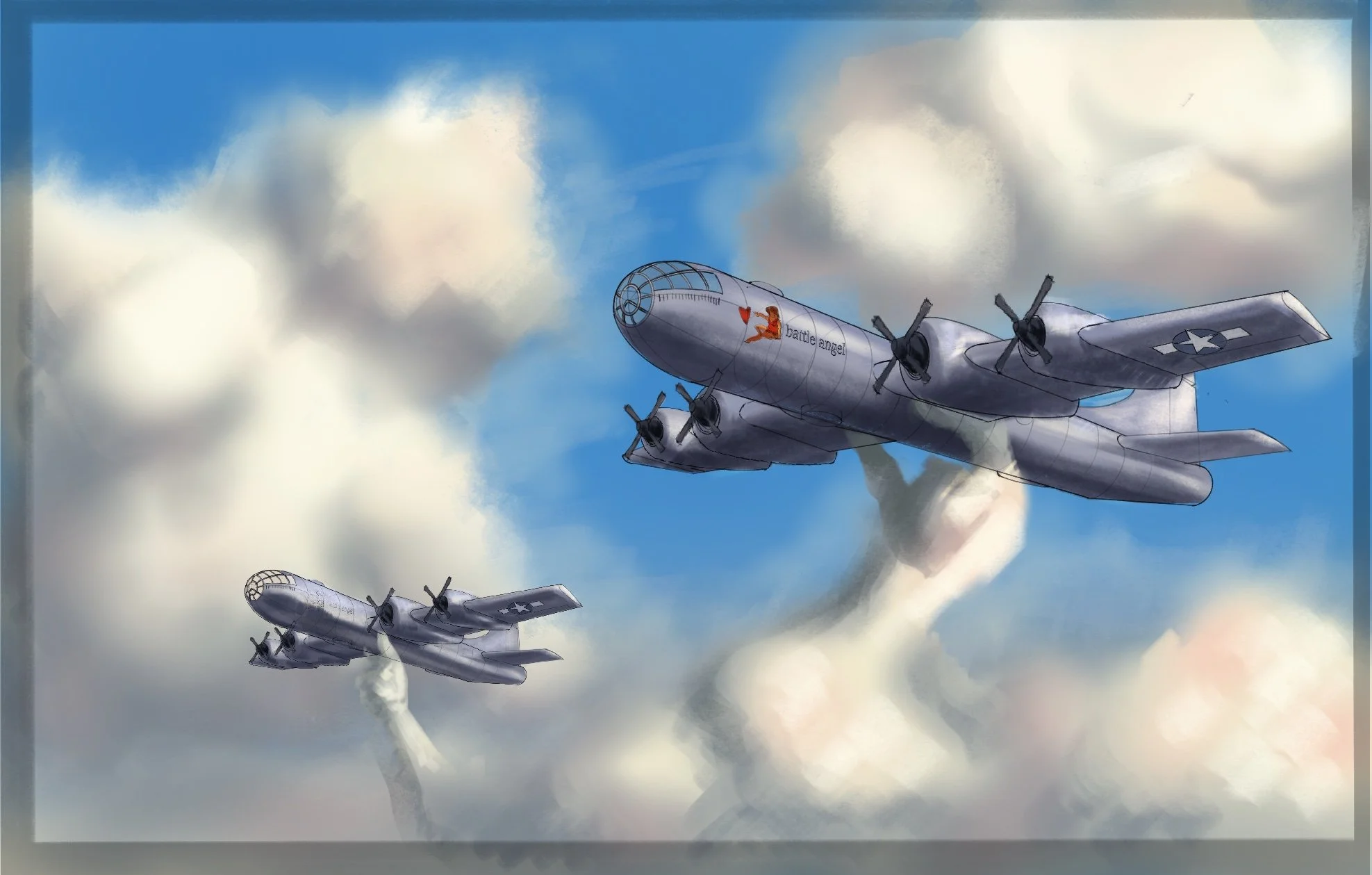
Ian Lim
Idea: The idea came from my childhood since me and my brother would always play with lego planes or model planes to reenact fights or crises and when I first started this piece, I wanted to draw clouds doing the same towards actual planes that were flying over the years of our civilization.
Materials: Procreate
Process: After getting a few ideas of how I wanted my concept to be, I started by finding the perfect model of plane. This helped me with the perspective and design of the plane. Then I designed where the clouds would be and started with the sky and clouds and then the plane. After many fixes the final piece was achieved.
CHRIST, REBUILD US
Audrie Kim
Idea: Encased within honeycombs (Psalm 119:103), the believers form one body of Christ, bound together by God’s Word. On the left, hexagons are clustered; on the right, dispersed. The bees close their gap, representing how Scripture unifies the faithful.
Materials: Graphite, Colored Pencil, Acrylic Wash, Watercolor Paint, Gel Pen
Process: Scenes of people I know in worship fill each cell, the waves in the background representing baptism and new life. The painted bees and honeycombs further the honey symbolism. The elements are then combined to visually express communal worship under God’s Word.
FALSE IDOLS
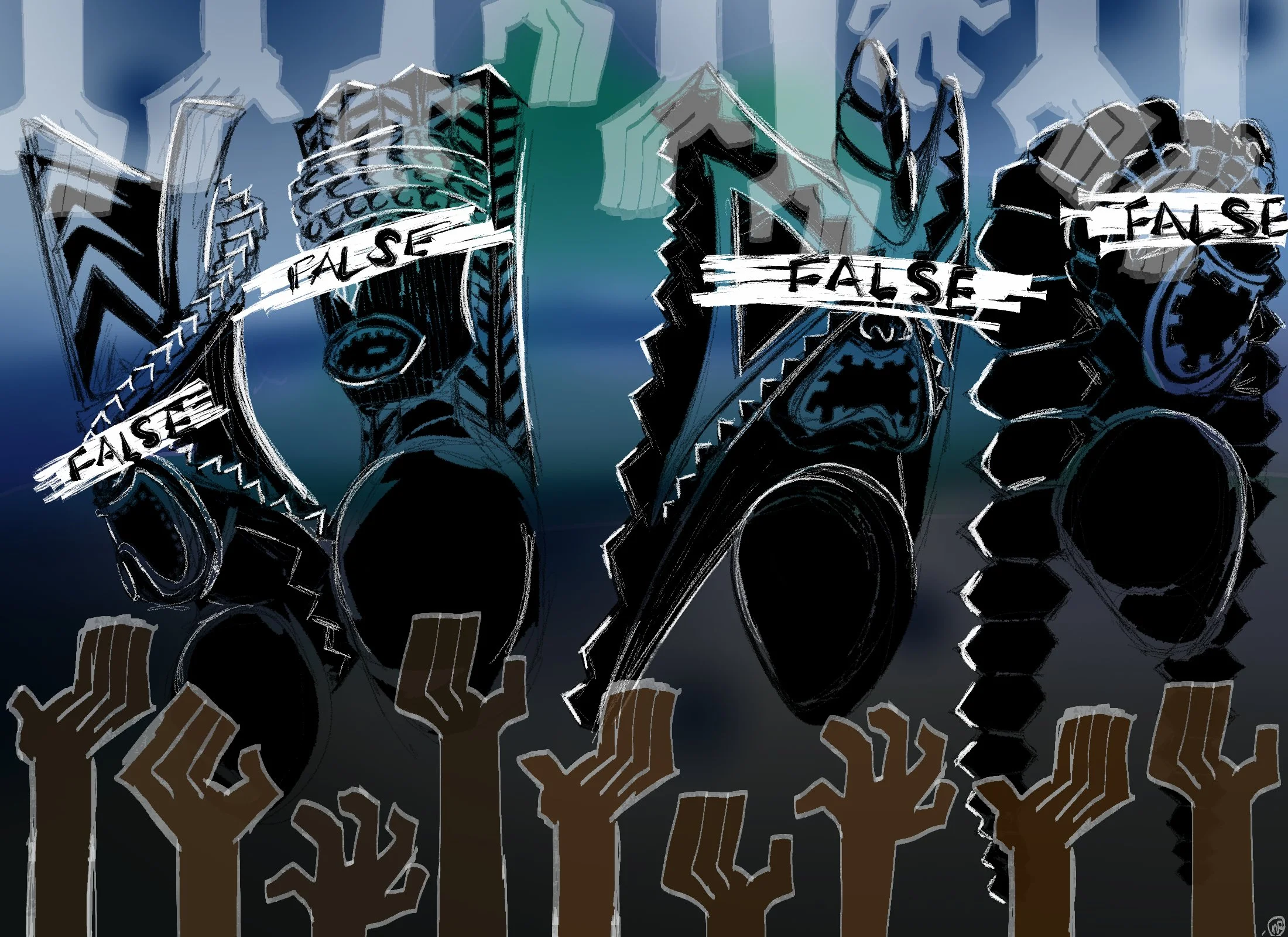
Nia Reyes
Idea: The idea for my work was to show the effect of colonization of pacific islanders. I wanted to make something more “positive” than what I usually draw, so I made this piece to show how missionaries/the imperial powers exposed the “gods” of the islands
Materials: Clip Studio Paint 3.0
Process: I originally just drew the 4 main Hawaiian Gods then changed it to them being worshiped. I added hands (bottom) to show the worship and got the idea to show the top hands revealing what frauds they were, hence the word “FALSE” over their eyes..